Email Promos are the way to go.
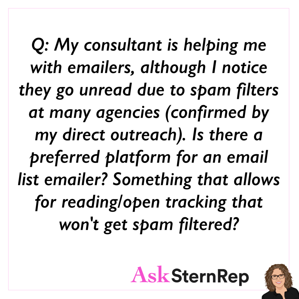
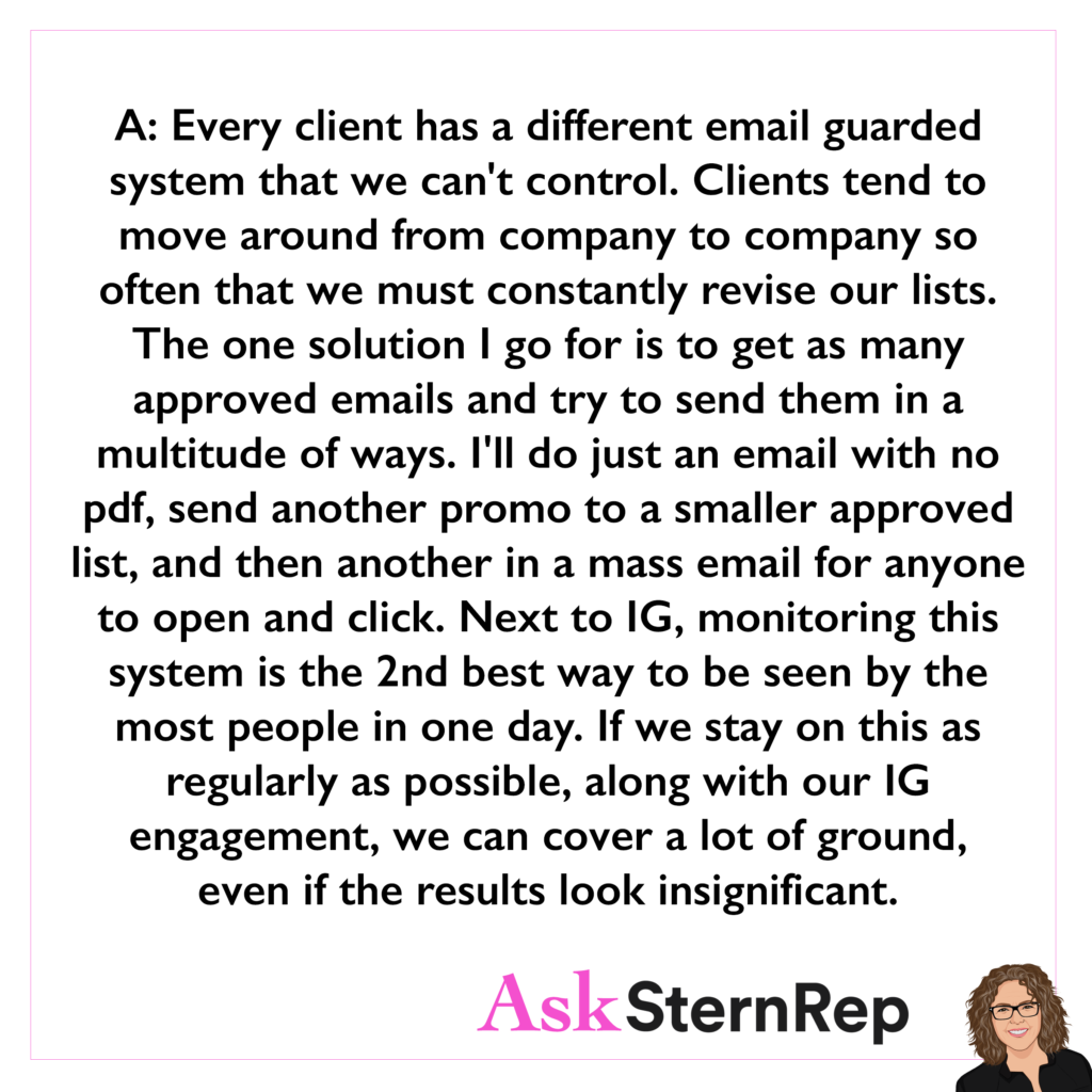
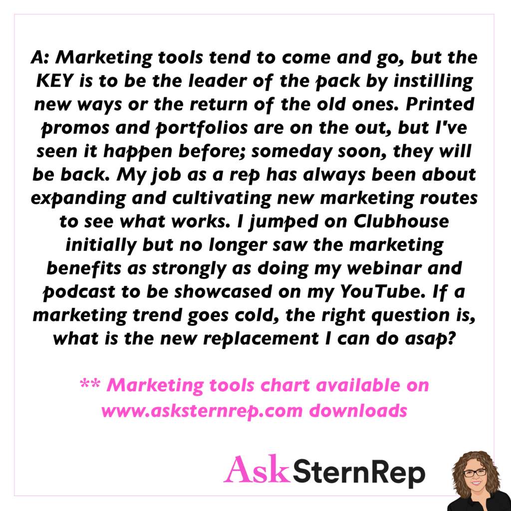
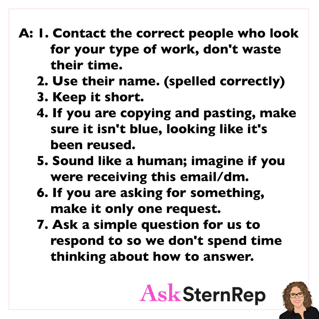
Years ago we would diversify with mailer promos, but nowadays, it’s challenging with many remote clients. The unsuccessful percentage of clicks and opened emails may discourage us, but how many opportunities do we have for 100 or 1000 potential clients to view our work? I invest in email promos even as many don’t get opened; the ones that do can be priceless.
We are so excited about a recent successful email promotion. We sent out a lot of email promos using a list called the Bikinilist and received two immediate responses to bid on this photographer. While the numbers may not always be on their side, sending out a big list can really pay off.

