How To Create An Effective Photography Portfolio That Gets Jobs in 2022
October 12, 2022The importance of a photographer’s portfolio cannot be overstated. A strong portfolio is the number one way to get hired in commercial photography. I hate to say it, but even a photographer with a terrible rep can still get work with a great portfolio.
Marketing has so many parts to it, but your portfolio will get you the job or not get you the job. We talk about treatments and creative calls; everything we do is essential, but they’re supplemental to your portfolio. That’s what is going to make or break you. It’s the portfolio. It’s everything.
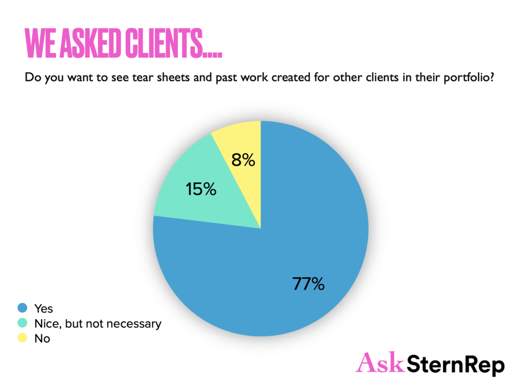
Your portfolio should not just be the jobs you have already photographed; it should include the jobs you want to be photographing.

What is a Portfolio?
Nowadays, a photographer’s portfolio can be seen in many ways – on a website, in a physical book, on an iPad, and Instagram + TikTok. A portfolio should showcase your best work – either for a client or self-assigned.
Three things clients look for in a portfolio:
- The seamless message of your style with a purpose.
- An emotional story, the audience is pulled into feeling, striking a chord with their brand’s message.
- The reassurance that their customers feel this emotion if they hire you.

What Goes into Shaping a Portfolio
Quick Tip: Focus specifically on the client/industry you most want to be working with and shape your portfolio around that market. Start with one area and master it. Then you can expand and grow.
1. PORTFOLIO RESEARCH
Industry education and research will help you master the “objective” eye, giving you the skills to edit your work. Familiarize yourself with photographers doing the kind of work you want to make, especially those doing it on a high level. Study them. Understand the difference between a cohesive portfolio with a clear through-line and those with many different styles. Identify your visual instincts and apply them every time you shoot. Learn to become objective in your opinions to be the best judge of your work.
2. CHOOSE THE STYLE
The constant honing-in and forward growth of what your style is about will bring you the control clients can depend on. Clients are always on the hunt for photographers shooting similar vibes as the message their company is portraying. If they are a tech company, they will want to see life scenes created around tech equipment, or a food client will want to see life happening around similar food environments. Build your portfolio showing the look and feel your ideal clients cater to by using “spec” concepts to grab their attention.
3. ATTITUDE (TESTING)
Owning who you are and finding ways to express it allows clients to know what they get by hiring you. Never underestimate the power of self-assigned projects. Integrating work into your portfolio conceptualized and executed by you is one of the most pivotal ways to expand your photography business into new ventures.
Consultants can be game changers because they know the business and how to shape your website/portfolio to fit the current market. When you aren’t hearing back often from clients, give a consultant a try and see what they have to say.
Websites
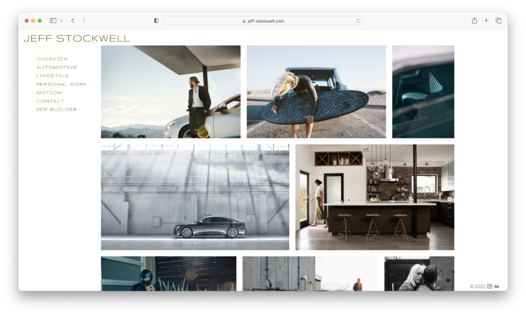
There are so many things that are right and wrong about websites – one thing we know for sure is they have to be fast. Include an overview on your website because clients won’t have time to click on different topics. They want a quick read to see if you are suitable for the job. The overview
brings you up a professional level, confidently having them scroll your best images without needing to click and search to get an immediate cohesive impression.
Since websites need to be easy, quick to read and serve the purpose of showing off your images in a constructive way that makes sense, select a company like Photofolio that has many different layouts. If you want to create your design, companies like Squarespace, Format, and PhotoShelter can be good options, but Photofolio has all the details already figured out for you.
What hurts your website:
- Confusing categories.
- A short scroll down or side to side with clicking involved.
- Self-designed without professional standards.
- Dated work showing images with older looks and styles.
- Inconsistent mistakes (spelling, repeated images, etc.).
Physical Portfolio Books
Printed portfolios can allow the viewer a much-needed break from screens. I prefer one image per page, as it will enable the image to sink in without distraction and project confidence. Exceptions to this could be if you’re using a designer and they are creating a specific look with multiple images per page. But I usually lean towards less is more.
I know photographers who present their work on printed 8x10s inside a beautifully made box as a way to stand out. The client can always see your website or social media feeds to get a fuller picture of your work. Create a well-designed package that feels like you and understand that the presentation might change to reflect current trends in a year or two. Keep it fresh – the bottom line is you want the client to see your style while having your images speak louder than the actual portfolio.
Today’s world is indeed an all-digital space, which is why a printed book can stand out even more. It’s old school, but it can demonstrate your style and allow people the luxury of taking in each photograph more thoughtfully than clicking. It can also provoke more conversation than simply clicking through a series of images. I highly recommend printed portfolios.
Quick Tip: A handy rule for promos and portfolios is never putting the date on them because it makes them unusable very quickly.
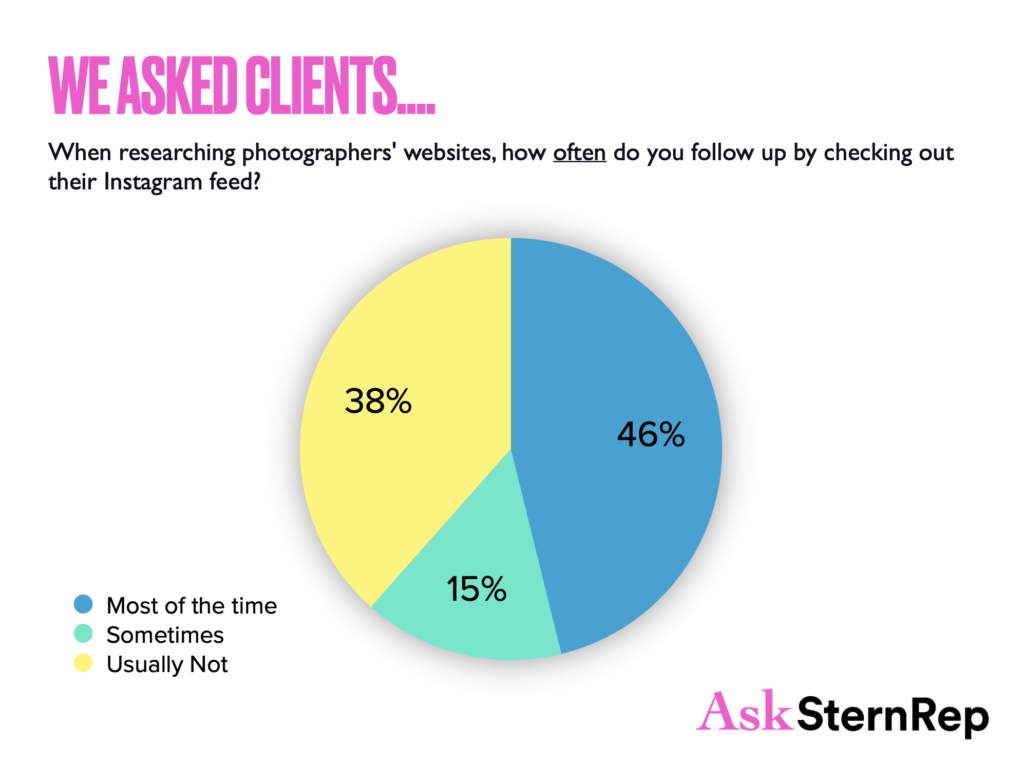
Have your IG work for you instead of against you. We all know that Instagram is the way to be seen and discovered – it’s a portfolio and email promo coming together. We must stick to the times and lead the way if we want to get the jobs.
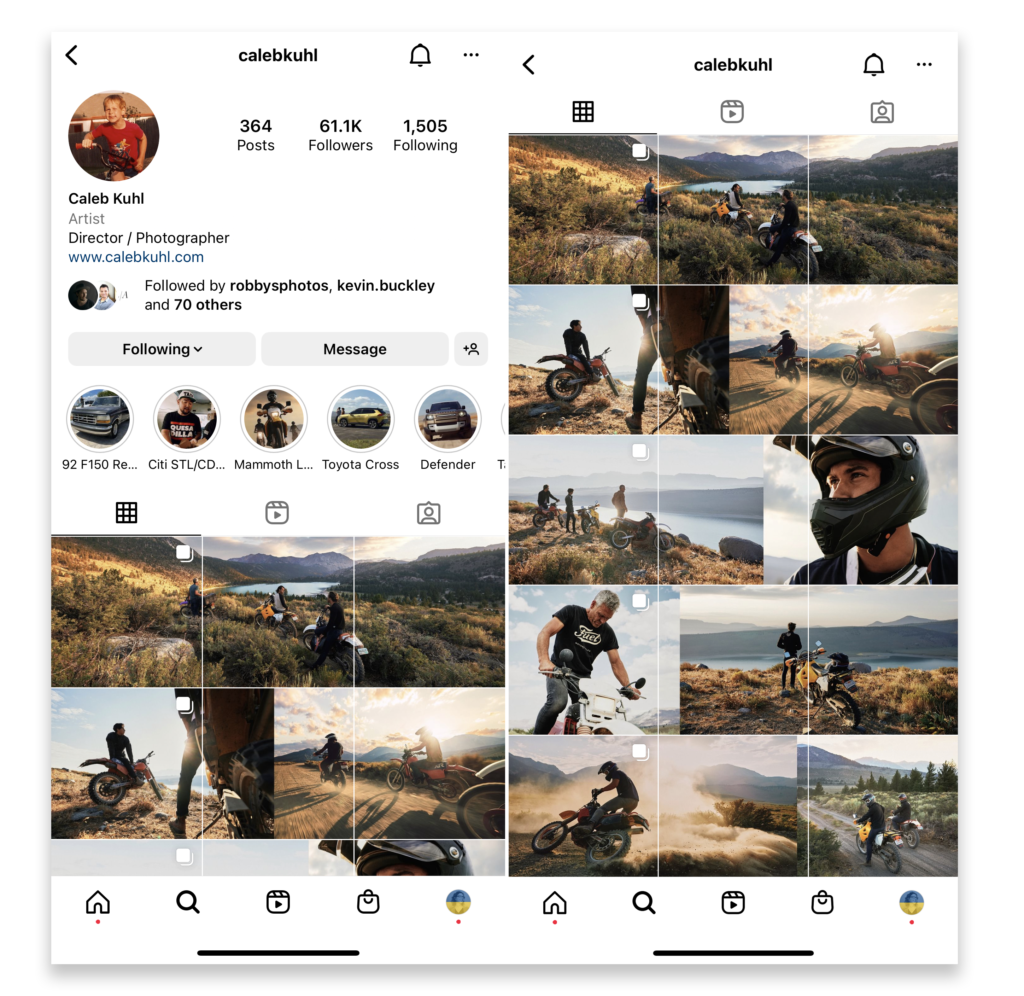
Websites and Instagram are two places you must keep strong and constantly updated, allowing them to sell you. Some clients will go to your website, and some will go to your IG account – some will go to both. Just as your website has your ABOUT section, which brings a bit of personal info to it – the same goes for Instagram. I suggest your Highlights be 80% portfolio images and 20% more personal or BTS.
Personal images should still be images that are interesting and educational to your clients. They want to know who you are and your hobbies, but they don’t need to know what your pets look like. They love seeing fun locations they’d want to visit, knowing where you are working, and learning interesting information about you.
You should post to Instagram as much as you’re comfortable. You don’t have to post daily, but it’s great if you can. The main thing is to be consistent – every two weeks is the minimum. You don’t want to be a month out from posting something and a client to come to your account and see that you haven’t posted in a month or two – you don’t look current, which can work against you in getting the job.

Portfolio Reviews
Portfolio reviews are a savvy way to get that one-on-one memorable personalized attention. These in-person and online events can connect you with the right potential clients that may offer valuable feedback. Be ready with your purpose to get the most out of your online/zoom portfolio reviews. What do you want to get out of it? Have your points of interest and questions ready to keep the topic flowing in the direction that fulfills your goal.
Standalone: Portfolios image selection has a different purpose with Ad Agencies vs. Client Direct work. Client-direct companies will be more understanding of various types of images. Ad agencies have so many photographers to choose from with an ever-changing artistic flow that they will choose the one who specializes in each specific topic repeatedly. The smaller, in-house companies will often use one photographer for all their photo needs. If Ad Agencies are your goal, identify your specialty and commit to excellence in that category.
What to Have Ready for a Portfolio Review
We know you probably aren’t a salesperson if you’re reading this, but you are a creative business. You need a sales or elevator pitch for portfolio reviews. It should express who you are or how you dealt with something on a shoot that makes you more valuable to them. You need to know your client, who they work with, and what scenarios might come up for them. Have a few stories or topics to discuss that show you can handle the job. Have these talking points ready so when you’re in the moment, you have these keywords to remember if there’s an awkward moment of silence or you only have one minute to make an impression. How are you going to say what you need to say? What would you say to this person? What do you want from this person? Do you want to take them to lunch? Do you want to have a meeting? Do you want to talk to them about an idea you have? Have it prepped and ready.
Do’s and Don’ts of Portfolio Reviews (in-person and online)
Do:
- Research the reviewers, especially on LinkedIn before choosing them.
- Use that research for those you weren’t able to see by connecting on LinkedIn.
- Make sure technicalities are in order – double check technical specifications.
- Have a plan set in advance for who is controlling the screen – you or them.
- Start with an icebreaker to make a personal connection.
- State your intentions – Do you want a job or feedback?
- Prep questions and topics specifically for them and what they work on.
- Listen and ask questions instead of talking too much.
- Find out what format your reviewer prefers – most like a prepared pdf but I like to see the website so I can remember the photographers in the future.
- Give them a take-away pdf leave behind.
- Remember the reviewers are exhausted, so be personable and give them a reason to smile.
- Reference other same event reviewers’ perspectives to see if they align with the current reviewer’s opinions (helps reviewer collect their thoughts).
- Have an “elevator pitch” ready to go or an interesting educational story to share about an image of how you handled some situation.
- Give a goodbye gift like chocolate or something personal to them, as the gift goes a lot way and will be remembered (in person).
Don’t:
- See irrelevant people for your topic when choosing reviewers as it can be a waste of time for both of you.
- Lose the connection you just made.
- Mail to people’s private home addresses without asking.
- Waste time on unimportant matters, as they go very fast.
- Talk too much – it can distract clients from seeing the images.
- Show too much work – tailor your portfolio to the reviewer.
Quick tip: We have better odds that clients will remember our work if we don’t speak as they flip through the portfolio pages.
Portfolio Reviews to Watch For / Favorites:
- Reps/Consultants (ASRconsulting) – Hire a consultant or rep that you trust to review your portfolio and offer feedback and insight
- APA – American Photographic Artists
- ASMP – American Society of Media Photographers
- AtEdge
- FotoWorks
- FocusOnWomen
- Art of Freelance
- Agency Book Showings – Request a portfolio review with a creative agency or watch for agencies to share an event for portfolio reviews
Where to Promote Your Portfolio
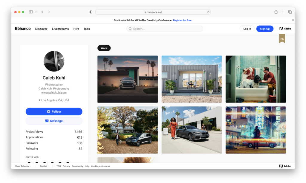
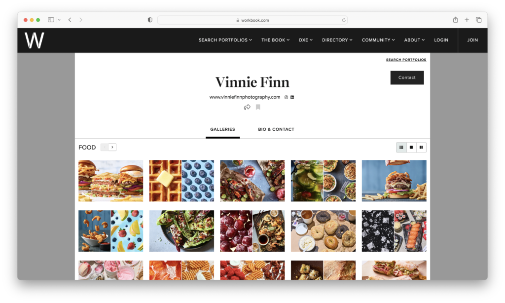
The business of photography depends on who sees our images; we have to find every potential method to put ourselves out there. Depending on your type of photography, we have some excellent options today with companies like Komyoon, Workbook, At-Edge, Blvd, Behance, Wonderful Machine, PhotoPolitic, LeBook, Production Paradise, and Found. They all have different purposes; go through them and see where you fit best. I suggest asking clients you want to work with where they look for new talent. After you give one of these a try, you can SEO your website and use Google Analytics to see where the traffic is coming in. It’s a timely process with no easy answer, but if you pay attention to your analytics, you can see what works for you.
